Project Overview
Academic Partnerships helps universities grow and students succeed by increasing access to high-quality, affordable and workforce-relevant education delivered online.
To support the growth of LaSalle University, the UX team was tasked with designing a landing page with minimal content that would focus on a student sharing their experience with the MBA program to prospective students.
My Role: UX/UI Designer
Team: UX/UI Designer, Senior Designer, Director of UX Design
Duration: 2 months – Remote Team
Toolbox: Adobe XD, Photoshop
Problem Statement
LaSalle’s MBA Program pages were underperforming in sign ups, despite interest from potential students. Users were overwhelmed by the content and not interested in applying or learning more about the programs.
Goals
- Increase sign ups for LaSalle University’s MBA programs
- Design a page with minimal content and a medium for alumni sharing their experiences in the MBA program with prospective students
Design Process
1. Research and Discovery
I collaborated with the product team to analyze user research, focusing on potential students who hold bachelor’s degrees and work full-time in their field. Among these users, MBA candidates showed the most interest in specializations, with over 70% aiming to complete the program in under 18 months. Over 90% are employed full-time, yet many expressed uncertainty about program completion.
2. Prototyping and Testing
Now armed with research findings, I designed and built a wireframe prototype and tested this with 4 users. They were assigned the following tasks and given up to 20 minutes to complete each task.
1. Select a Program and ‘apply’ for the program
2. Review the programs and ‘request info’
3. Review the video testimonial
All users were able to complete the assigned tasks within the allotted time with no assistance.
Wireframes

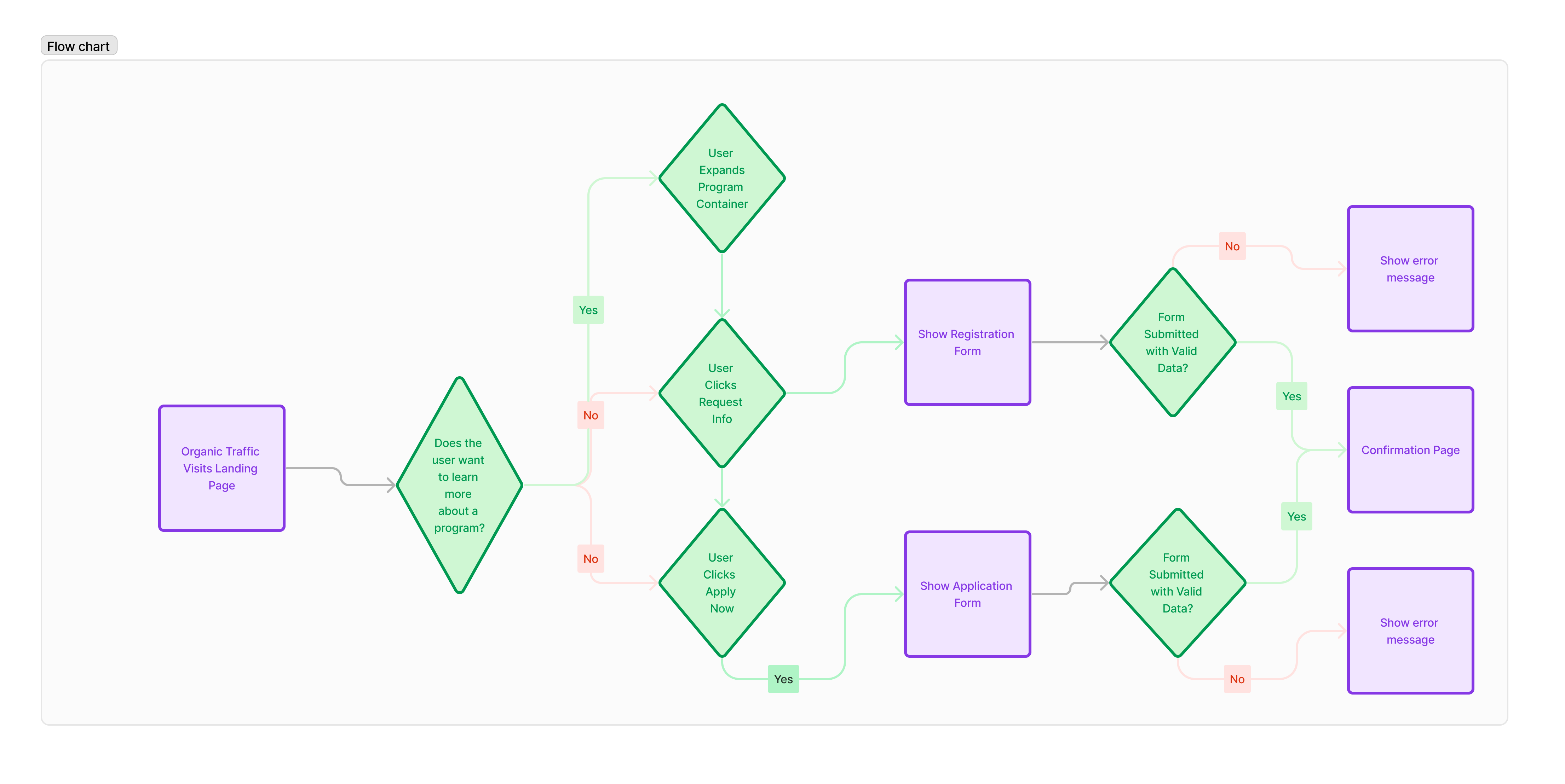
User Journey
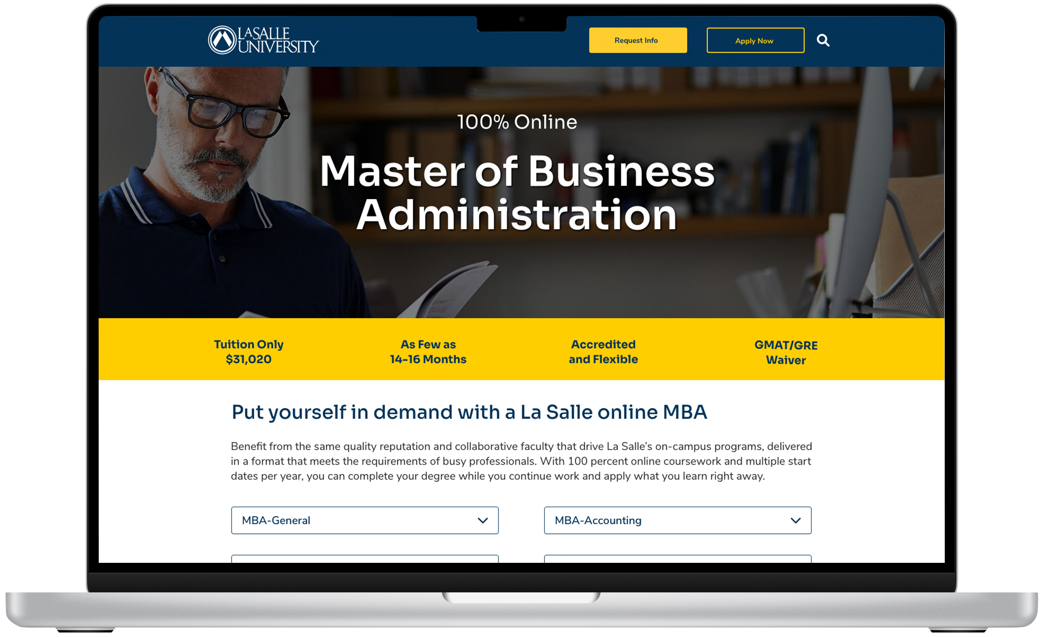
3. Visual Design
To declutter the page, “Request Info” and “Apply Now” forms were converted into modal windows, activated by clicking the respective CTAs. This strategy has boosted leads on most Academic Partnerships landing pages, endorsed as a UX best practice.
Programs are now grouped into collapsible containers to reduce cognitive load. Initially closed, these containers improve page organization. Following this, a video testimonial featuring a student relatable to over 70% of surveyed students is featured.
Credentials content was omitted based on research showing prospective students prioritize relatability over institutional credentials.
Final Design

4. Development Handoff
For handoff, I verified UI component behaviors, site accessibility and specs, shared files and prototype link with the development team.
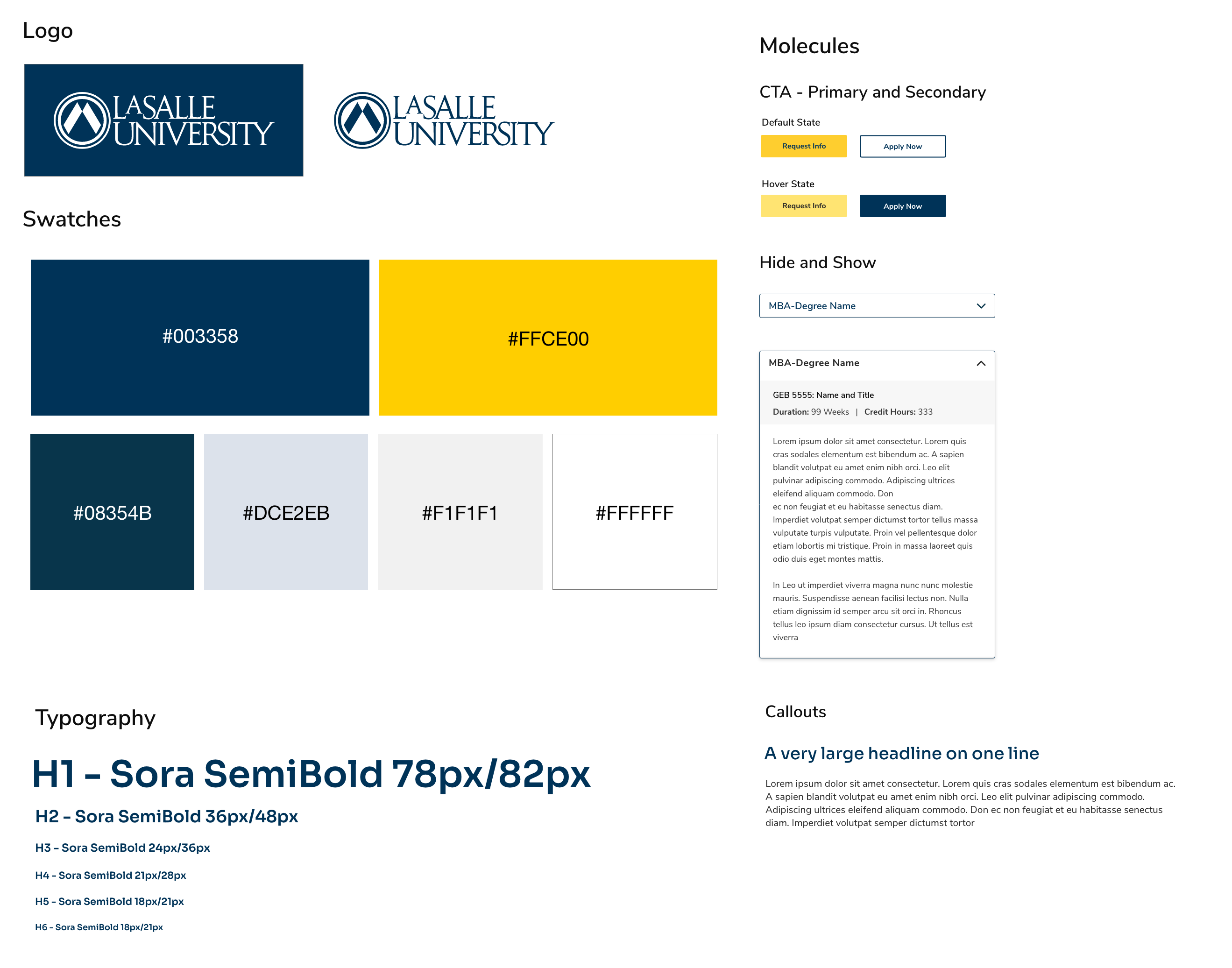
Style Tile
5. Testing and QA
Conducted accessibility and user testing with 6 users to ensure the website is bug-free and functions as intended. Logged issues into ticketing and assigned to the correct teams.
Results and Reflections
This landing page campaign is set to launch in Q2 of 2024. My biggest takeaway from the research and design testing is the fact that these students prioritize relatable experiences over school awards and accreditation. This provides valuable insights into student motivations and concerns regarding earning an MBA. This will undoubtedly be useful in understanding future user needs and ways to meet those needs.